Lesson 5: Assembling the Pieces to Build the App
In the previous lessons, we have set up:
- A Runtime action to perform CRUD operations for to-do items
CreateTodoListReact component to create a to-do listTodoReact component to display and update a to-do itemTodoListReact component to display to-do items
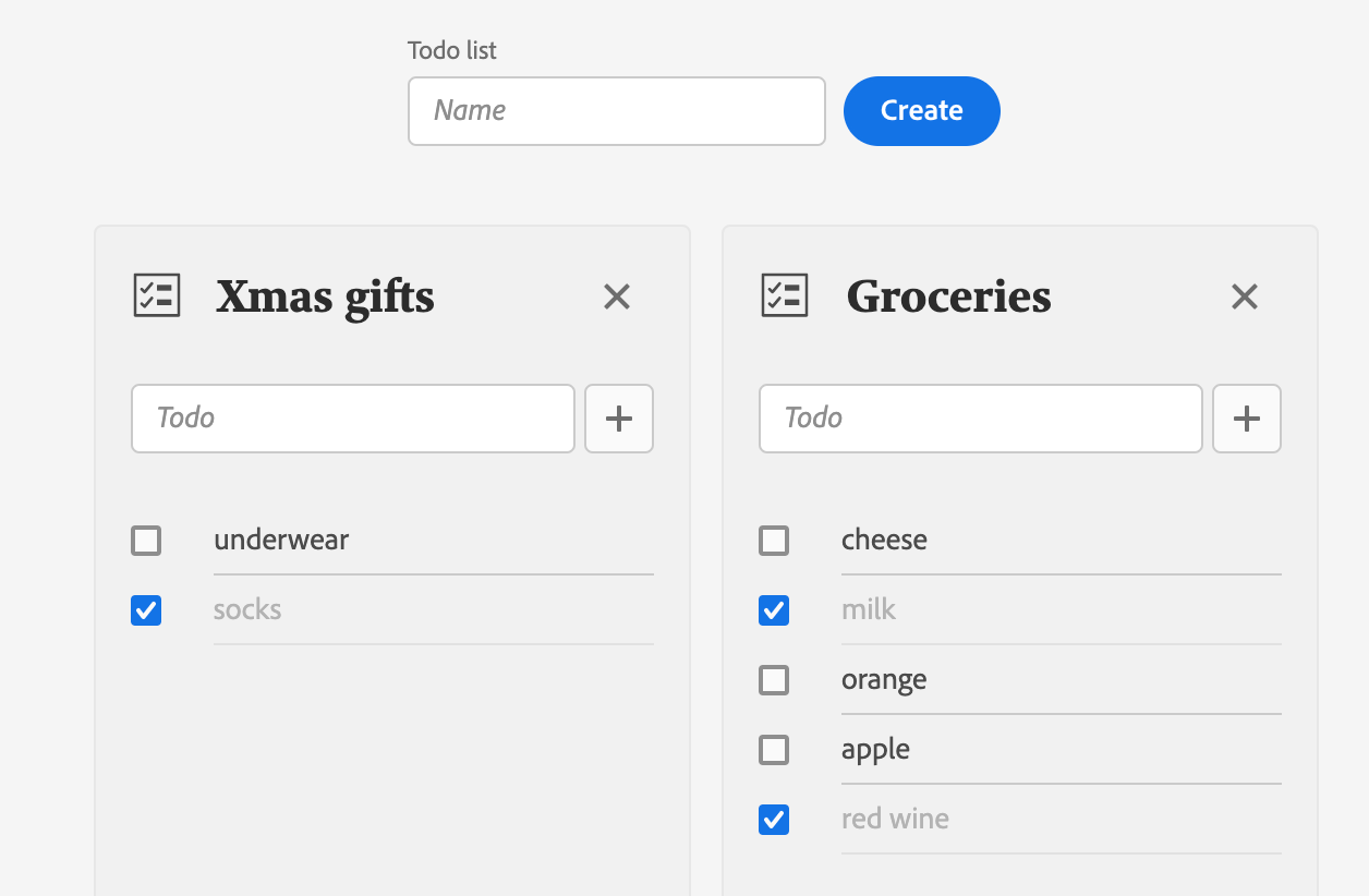
In this lesson, we'll build the actual App to manage to-do lists. We'll create the React component file under web-src/src/components/ and name it App.js.
We'll start by importing our components:
Copied to your clipboardimport { CreateTodoList } from './CreateTodoList';import { TodoList } from './TodoList';
Import React Spectrum components
This component will make use of several React Spectrum components:
- Provider, the container of the React Spectrum application.
- defaultTheme, the default React Spectrum theme.
- ProgressCircle, the loading indicator.
- View, a generic container.
- Flex, for the layout of the loading indicator.
- Grid, for the layout of the todo lists.
- Repeat, a helper function for Grid.
Copied to your clipboardimport { Provider, defaultTheme, View, Flex, Grid, repeat, ProgressCircle } from '@adobe/react-spectrum';
Component property
The component will accept a single property, the ims information that we'll pass to the Runtime action for authentication:
Copied to your clipboardfunction App({ ims }) {// ...}
Component state values
On initialization, the App will display a loading indicator while fetching the todo lists. For the loading indicator and the to-do lists, we'll use the State hook useState again.
Copied to your clipboardconst [isLoading, setIsLoading] = useState(true);const [todoList, setTodoList] = useState([]);
Action function callbacks
To communicate with the Runtime action, we'll create a simple utility function with two parameters:
- The expected CRUD operation.
- The sent data, that is, the to-do list name or todo object.
First, besure to import the config.json which contains the URL to your Runtime action.
Copied to your clipboardimport actions from '../config.json';
Then, inside the App, we'll define the utility function with the ims information:
Copied to your clipboardconst action = async (operation, body = {}) => {const res = await fetch(actions['todolist'], {method: 'POST',headers: {'Content-Type': 'application/json','x-gw-ims-org-id': ims.org,authorization: `Bearer ${ims.token}`},body: JSON.stringify({operation,...body})});return await res.json();};
Finally, we'll use the utility function inside callback functions that we're going to pass as prop to the components we have built in the previous lessons:
Copied to your clipboardconst onCreateTodoList = async (name) => {if (!todoList.find(({ name: todoListName }) => name === todoListName)) {setTodoList([{ name, todos: [] }, ...todoList]);console.log(await action('create', { name }));}};const onDeleteTodoList = async (name) => {setTodoList(todoList.filter(({ name: toDeleteName }) => name !== toDeleteName));console.log(await action('delete', { name }));};const onUpdateTodoList = async (name, todo) => {console.log(await action('update', { name, todo }));};
Loading indicator
By default, we'll be showing a ProgressCircle to indicate that the App is loading. Meanwhile, the to-do lists will be fetched using an Effect Hook which will run only once when the App is mounted.
Once we've retrieved the to-do lists, well update the to-do list state and set the loading state to false:
Copied to your clipboarduseEffect(() => {(async () => {const { todoList } = await action('read');if (todoList) {setTodoList(todoList);setIsLoading(false);}})();}, []);
With React Conditional Rendering, we can easily define what will be rendered based on the isLoading state. Once the state value is set to false, we'll display the CreateTodoList from lesson 3 and pass the onCreateTodoList callback function as prop:
Copied to your clipboard<View elementType="main" minHeight="100vh">{isLoading ? (<Flex alignItems="center" justifyContent="center" height="100vh"><ProgressCircle size="L" aria-label="Loading…" isIndeterminate /></Flex>) : (<View height="size-800" marginY="size-400"><CreateTodoList onCreate={onCreateTodoList} />...</View>)}</View>
Rendering to-do lists
Next to CreateTodoList, we'll also render the to-do lists. For that, we're going to use the React Spectrum Grid component.
As in the previous lesson, we'll iterate over the todoList array using the map() function to render each item as TodoList component:
Copied to your clipboard<Gridcolumns={repeat('auto-fit', 'size-3400')}autoRows="size-6000"justifyContent="center"gap="size-200">{todoList.map((list) => (<TodoList key={list.name} todoList={list} onDelete={onDeleteTodoList} onUpdate={onUpdateTodoList} />))}</Grid>
Since to-do list names are unique, we're using the name as key prop. We're also passing the todoList object and the onDelete, onUpdate function callbacks as props to the TodoList component.
Full component
Finally, we'll wrap the App inside the React Spectrum Provider with the default theme set to light, which corresponds to the Experience Cloud Shell main content theme.
Copied to your clipboard<Provider theme={defaultTheme} colorScheme={`light`}>...</Provider>
See the full component code here.


